toolsmith #108: Visualizing Network Data with Network Data

Prerequisites

R development environment (R, RStudio)

This month finds us in a new phase for toolsmith as it will not be associated with ISSA or the ISSA Journal any further. Suffice it to say that the ISSA board and management organization decided they no longer wanted to pay the small monthly stipend I’d been receiving since the inception of the toolsmith column. As I am by no means a profiteer, I am also not a charity, so we simply parted ways. All the better I say, as I have been less than satisfied with ISSA as an organization: Ira Winkler and Mary AnnDavidson should serve to define that dissatisfaction.
I will say this, however. All dissatisfaction aside, it has been my distinct pleasure to write for the ISSA Journal editor, Thom Barrie, who has been a loyal, dedicated, committed, and capable editor and someone I consider a friend. I will miss our monthly banter, I will miss him, and I thank him most sincerely for these nine years as editor. The ISSA Journal is better for his care and attention. Thank you, Thom.

Enough said, what’s next? I’ll continue posting toolsmith here while I consider options for a new home or partnership. I may just stick exclusively to my blog and see if there is a sponsor or two who might be interested in helping me carry the toolsmith message.

I thought I’d use our new circumstances to test a few different ideas with you over the next few months, your feedback is welcome as always, including ideas regarding what you might like to see us try. As always toolsmith will continue to offers insights on tools useful to the information security practitioner, typically open source and free.
To that end, I thought I’d offer you a bit of R code I recently cranked out for a MOOC I was taking. The following visualizations with R are the result of fulfilling a recent assignment for Coursera’s online Data Visualization class. The assignment was meant to give the opportunity to do non-coordinate data visualization with network data as it lends itself easily to graph visualization. I chose, with a bit of cheekiness in mind, to visualize network data…wait for it…with security-related network data.
Data Overview

I gathered data for the assignment from a network traffic packet capture specific to malware called Win32/Sirefef or ZeroAccess that uses stealth to hide its presence on victim systems. This Trojan family runs the gamut of expected behaviors, including downloading and running additional binaries, contacting C2, and disabling system security features. The Microsoft Malware Protection Center reference is here.
The packet capture I used was gathered during a ZeroAccess run-time analysis in my lab using a virtualized Windows victim and Wireshark, which allowed me to capture data to be saved as a CSV. The resulting CSV provides an excellent sample set inclusive of nodes and edges useful for network visualization. Keep in mind that this is a small example with a reduced node count to avoid clutter and serve as an exemplar. A few notes about the capture:

  • Where the protocol utilized was HTTP, the resulting packet length was approximately 220 bytes.
  • Where the protocol was TCP other than HTTP, the resulting packet length was approximately 60 bytes.
  • For tidy visualization these approximations are utilized rather than actual packet length.
  • Only some hosts utilized HTTP, specific edges are visualized where appropriate.

A summary of the data is available for your review after the Graphviz plots at the end of this document.

DiagrammeR and Graphviz

The DiagrammeR package for R includes Graphviz, which, in turn, includes four rendering engines including dot, neato, twopi, and circo. I’ve mentioned Graphviz as part of my discussion of ProcDot and AfterGlow as it is inherent to both projects. The following plots represent a subset of the ZeroAccess malware network traffic data.
– The green node represents the victim system.
Red nodes represent the attacker systems.
Orange nodes represent the protocol utilized.
– The cyan node represent the length of the packet (approximate.)
Black edges represent the network traffic to and from the victim and attackers.
Orange edges represent hosts conversing over TCP protocol other than HTTP.
Cyan edges represent the relationship of protocol to packet length.
Purple edges represent hosts communicating via the HTTP protocol.
Graphs are plotted in order of my preference for effective visualization; code for each follows.

After these first four visualizations, keep reading, I pulled together a way to read in the related CSV and render a network graph automagically.

————————————————————————————————————————–
Visualization 1: Graphviz ZeroAccess network circo plot


Visualization 1 code


library(DiagrammeR)
grViz("
digraph {

graph [overlap = false]

node [shape = circle,
style = filled,
color = black,
label = '']

node [fillcolor = green]
a [label = '192.168.248.21']

node [fillcolor = red]
b [label = '176.53.17.23']
c [label = '46.191.175.120']
d [label = '200.112.252.155']
e [label = '177.77.205.145']
f [label = '124.39.226.162']

node [fillcolor = orange]
g [label = 'TCP']
h [label = 'HTTP']

node [fillcolor = cyan]
i [label = '60']
j [label = '220']

edge [color = black]
a -> {b c d e f}
b -> a
c -> a
d -> a
e -> a
f -> a

edge [color = orange]
g -> {a b c d e f}

edge [color = purple]
h -> {a b}

edge [color = cyan]
g -> i
h -> j
}"
,
engine = "circo")

————————————————————————————————————————–

Visualization 2: Graphviz ZeroAccess network dot plot

Visualization 2 code

library(DiagrammeR)
grViz("
digraph {

graph [overlap = false]

node [shape = circle,
style = filled,
color = black,
label = '']

node [fillcolor = green]
a [label = '192.168.248.21']

node [fillcolor = red]
b [label = '176.53.17.23']
c [label = '46.191.175.120']
d [label = '200.112.252.155']
e [label = '177.77.205.145']
f [label = '124.39.226.162']

node [fillcolor = orange]
g [label = 'TCP']
h [label = 'HTTP']

node [fillcolor = cyan]
i [label = '60']
j [label = '220']

edge [color = black]
a -> {b c d e f}
b -> a
c -> a
d -> a
e -> a
f -> a

edge [color = orange]
g -> {a b c d e f}

edge [color = purple]
h -> {a b}

edge [color = cyan]
g -> i
h -> j
}"
,
engine = "dot")

————————————————————————————————————————–
Visualization 3: Graphviz ZeroAccess network twopi plot


Visualization 3 code

library(DiagrammeR)
grViz("
digraph {

graph [overlap = false]

node [shape = circle,
style = filled,
color = black,
label = '']

node [fillcolor = green]
a [label = '192.168.248.21']

node [fillcolor = red]
b [label = '176.53.17.23']
c [label = '46.191.175.120']
d [label = '200.112.252.155']
e [label = '177.77.205.145']
f [label = '124.39.226.162']

node [fillcolor = orange]
g [label = 'TCP']
h [label = 'HTTP']

node [fillcolor = cyan]
i [label = '60']
j [label = '220']

edge [color = black]
a -> {b c d e f}
b -> a
c -> a
d -> a
e -> a
f -> a

edge [color = orange]
g -> {a b c d e f}

edge [color = purple]
h -> {a b}

edge [color = cyan]
g -> i
h -> j
}"
,
engine = "twopi")


————————————————————————————————————————–

Visualization 4: Graphviz ZeroAccess network neato plot

Visualization 4 code


library(DiagrammeR)
grViz("
digraph {

graph [overlap = false]

node [shape = circle,
style = filled,
color = black,
label = '']

node [fillcolor = green]
a [label = '192.168.248.21']

node [fillcolor = red]
b [label = '176.53.17.23']
c [label = '46.191.175.120']
d [label = '200.112.252.155']
e [label = '177.77.205.145']
f [label = '124.39.226.162']

node [fillcolor = orange]
g [label = 'TCP']
h [label = 'HTTP']

node [fillcolor = cyan]
i [label = '60']
j [label = '220']

edge [color = black]
a -> {b c d e f}
b -> a
c -> a
d -> a
e -> a
f -> a

edge [color = orange]
g -> {a b c d e f}

edge [color = purple]
h -> {a b}

edge [color = cyan]
g -> i
h -> j
}"
,
engine = "neato")

Read in a CSV and render plot

Populating graphs arbitrarily as above as examples is nice…for examples. In the real world, you’d likely just want to read in a CSV derived from a Wireshark capture.
As my code is crap at this time, I reduced zeroaccess.csv to just the source and destination columns, I’ll incorporate additional data points later. To use this from your own data, reduce CSV columns down to source and destination only.
Code first, with comments to explain, derived directly from Rich Iannone’s DiagrammerR example for using data frames to define Graphviz graphs.

Visualization 5 is your result. As you can see, 192.168.248.21 is the center of attention and obviously our ZeroAccess victim. Yay, visualization!

Visualization 5

Following is a quick data summary, but you can grab it from Github too.

Network Data

Summary: zeroaccess.csv


zeroaccess  read.csv("zeroaccess.csv", sep = ",")->
summary(zeroaccess)

##             Source            Destination  Protocol       Length       
## 192.168.248.21:340 192.168.248.21:152 HTTP: 36 Min. : 54.00
## 176.53.17.23 : 90 176.53.17.23 : 90 TCP :456 1st Qu.: 60.00
## 140.112.251.82: 6 140.112.251.82: 6 Median : 62.00
## 178.19.22.191 : 6 178.19.22.191 : 6 Mean : 84.98
## 89.238.36.146 : 6 89.238.36.146 : 6 3rd Qu.: 62.00
## 14.96.213.41 : 3 1.160.72.47 : 3 Max. :1506.00
## (Other) : 41 (Other) :229

head(zeroaccess)

##           Source    Destination Protocol Length
## 1 192.168.248.21 176.53.17.23 TCP 62
## 2 192.168.248.21 176.53.17.23 TCP 62
## 3 192.168.248.21 176.53.17.23 TCP 62
## 4 176.53.17.23 192.168.248.21 TCP 62
## 5 192.168.248.21 176.53.17.23 TCP 54
## 6 192.168.248.21 176.53.17.23 HTTP 221

In closing

Hopefully this leads you to wanting to explore visualization of security data a bit further, note the reference material in Acknowledgments.
I’ve stuffed all this material on Github for you as well and will keep working on the CSV import version as well.
Ping me via email or Twitter if you have questions (russ at holisticinfosec dot org or @holisticinfosec). Cheers…until next month.

Acknowledgements

Rich Iannone for DiagrammeR and the using-data-frames-to-define-graphviz-graphs example
Jay and Bob for Data-Driven Security (the security data scientist’s bible)

Continue reading toolsmith #108: Visualizing Network Data with Network Data

toolsmith – Jay and Bob Strike Back: Data-Driven Security


Prerequisites
Data-Driven Security: Analysis, Visualization and Dashboards
R and RStudio as we’ll only focus on the R side of the discussion
All other dependencies for full interactive use of the book’s content are found in Tools You Will Need in the books Introduction.
Introduction
When last I referred you to a book as a tool we discussed TJ O’Connor’s Violent Python. I’ve since been knee deep in learning R and quickly discovered Data-Driven Security: Analysis, Visualization and Dashboards from Jay Jacobs and Bob Rudis, hereafter referred to a Jay and Bob (no, not these guys).
Jay and Silent Bob Strike Back 🙂
Just so you know whose company you’re actually keeping here Jay is a coauthor of Verizon Data Breach Investigation Reports and Bob Rudis was named one of the Top 25 Influencers in Information Security by Tripwire.
I was looking to make quick use of R as specific to my threat intelligence & engineering practice as it so capably helps make sense of excessive and oft confusing data. I will not torment you with another flagrant misuse of big data vendor marketing spew; yes, data is big, we get it, enough already. Thank goodness, the Internet of Things (IoT) is now the most abused, overhyped FUD-fest term. Yet, the reality is, when dealing with a lot of data, tools such as R and Python are indispensable particularly when trying to quantify the data and make sense of it. Most of you are likely familiar with Python but if you haven’t heard of R, it’s a scripting language for statistical data manipulation and analysis. There are a number of excellent books on R, but nowhere will you find a useful blending of R and Python to directly support your information security analysis practice as seen in Jay and Bob’s book. I pinged Jay and Bob for their perspective and Bob provided optimally:
“Believe it or not, we (and our readers) actually have ZeroAccess to thank for the existence of Data-Driven Security (the book, blog and podcast). We started collaborating on security data analysis & visualization projects just about a year before we began writing the book, and one of the more engaging efforts was when we went from a boatload of ZeroAccess latitude & longitude pairs (and only those pairs) to maps, statistics and even graph analyses. We kept getting feedback (both from observation and direct interaction) that there was a real lack of practical data analysis & visualization materials out there for security practitioners and the domain-specific, vendor-provided tools were and are still quite lacking. It was our hope that we could help significantly enhance the capabilities and effectiveness of organizations by producing a security-centric guide to using modern, vendor-agnostic tools for analytics, a basic introduction to statistics and machine learning, the science behind effective visual communications and a look at how to build a great security data science team.
One area we discussed in the book, but is worth expanding on is how essential it is for information security professionals to get plugged-in to the broader “data science” community. Watching “breaker-oriented” RSS feeds/channels is great, but it’s equally as important to see what other disciplines are successfully using to gain new insights into tough problems and regularly tap into the wealth of detailed advice on how to communicate your messages as effectively as possible. There’s no need to reinvent the wheel or use yesterday’s techniques when trying to stop tomorrow’s threats.”
Well said, I’m a major advocate for the premise of moving threat intelligence beyond data brokering as Bob mentions. This books endeavors and provides the means with which to conduct security data science. According to Booz Allen’s The Field Guide to Data Science, “data science is a team sport.” While I’m biased, nowhere is that more true than the information security field. As you embark on the journey Data-Driven Security: Analysis, Visualization and Dashboards (referred to hereafter as DDSecBook) intends to take you on you’ll be provided with direction on all the tools you need, so we’ll not spend much time there and instead focus on the applied use of this rich content. I will be focusing solely on the R side of the discussion though as that is an area of heavy focus for me at present.  DDSecBook is described with the byline Uncover hidden patterns of data and respond with countermeasures. Awesome, let’s do just that.
Data-Driven Security
DDSecBook is laid out in such a manner as to allow even those with only basic coding or scripting (like me; I am the quintessential R script kiddie) to follow along and grow while reading and experimenting:
1.       The Journey to Data-Driven Security
2.       Building Your Analytics Toolbox: A Primer on Using R and Python for Security Analysis
3.       Learning the “Hello World” of Security Data Analysis
4.       Performing Exploratory Security Data Analysis
5.       From Maps to Regression
6.       Visualizing Security Data
7.       Learning from Security Breaches
8.       Breaking Up with Your Relational Database
9.       Demystifying Machine Learning
10.   Designing Effective Security Dashboards
11.   Building Interactive Security Visualizations
12.   Moving Toward Data-Driven Security
For demonstrative purposes of making quick use of the capabilities described, I’ll focus our attention on chapters 4 and 6. As a longtime visualization practitioner I nearly flipped out when I realized what I’d been missing in R, so chapters 4 and 6 struck close to home for me. DDSecBook includes code downloads for each chapter and the related data so you can and should play along as you read. Additionally, just to keep things timely and relevant, I’ll apply some of the techniques described in DDSecBook to current data of interest to me so you can see how repeatable and useful these methods really are.
Performing Exploratory Security Data Analysis
Before you make use of DDSecBook, if you’re unfamiliar with R, you should read An Introduction to R, Notes on R: A Programming Environment for DataAnalysis and Graphics and run through Appendix A. This will provide at least an inkling of the power at your fingertips.
This chapter introduces concepts specific to dissecting IP addresses including their representation, conversion to and from 32-bit integers, segmenting, grouping, and locating, all of which leads to augmenting IP address data with the likes of IANA data. This is invaluable when reviewing datasets such as the AlienVault reputation data, mentioned at length in Chapter 3, and available as updated hourly.
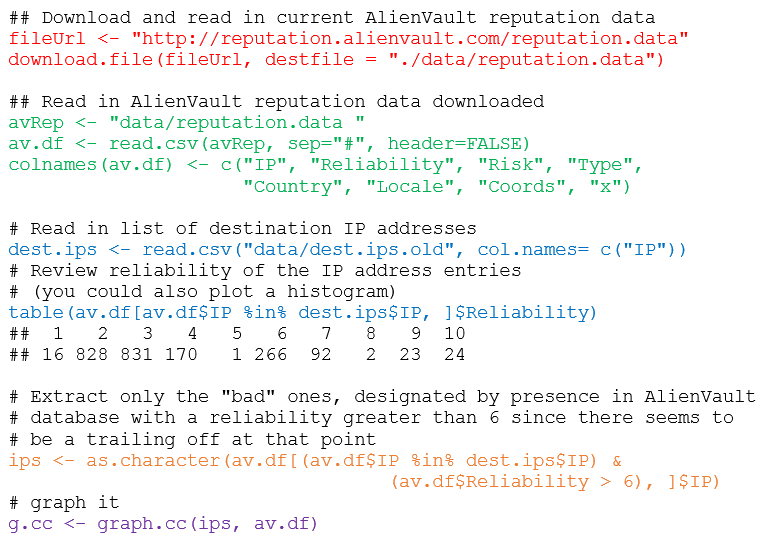
We’ll jump ahead here to Visualizing Your Firewall Data (Listing 4-16) as it provides a great example of taking methods described in the book and applying it immediately to yourdata. I’m going to set you up for instant success but you will have to work for it a bit. The script we’re about to discuss takes a number of dependencies created earlier in the chapter; I’ll meet them in the script for you (you can download it from my site), but only if you promise to buy this book and work though all prior exercises for yourself. Trust me, it’s well worth it. Here’s the primary snippet of the script, starting at line 293 after all the dependencies are met. What I’ve changed most importantly is the ability to measure an IP list against the very latest AlienVault reputation data. Note, I found a bit of a bug here that you’ll need to update per the DDSecBook blog. This is otherwise all taken directly ch04.r in the code download with specific attention to Listing 4-16 as seen in Figure 2.
FIGURE 2: R code to match bad IPs to AlienVault reputation data
I’ve color coded each section to give you a quick walk-through of what’s happening.
1)      Defines the URL from which to download the AlienVault reputation data and provides a specific destination to download it to.
2)      Reads in the AlienVault reputation data, creates a data framefrom the data and provides appropriate column names. If you wanted to read the top of that data from the data frame, using head(av.df, 10) would result in Figure 3.
FIGURE 3: The top ten entries in the Alien Vault data frame
3)      Reads in the list of destination IP addresses, from a firewall log list as an example, and compares it against matches on the reliability column from the AlienVault reputation data.
4)      Reduces the dataset down to only matches for reliability above a rating of 6 as lower tends to be noise and of less value.
5)      Produces a graph with the graph.cc function created earlier in the ch04.r code listing.
The results are seen in Figure 4 where I mapped against the Alien Vault reputation data provided with the chapter 4 download versus brand new AlienVault data as of 25 AUG 2014.
FIGURE 4: Bad IPs mapped against Alien Vault reputation data by type and country
What changed, you ask? The IP list provided with chapter 4 data is also a bit dated (over a year now) and has likely been cleaned up and is no longer of ill repute. When I ran a list 6100 IPs I had that were allegedly spammers, only two were identified as bad, one a scanning host, the other for malware distribution. 
Great stuff, right? You just made useful, visual sense of otherwise clunky data, in a manner that even a C-level executive could understand. 🙂
Another example the follows the standard set in Chapter 6 comes directly from a project I’m currently working on. It matches the principles of said chapter as built from a quote from Colin Ware regarding information visualization:
“The human visual system is a pattern seeker of enormous power and subtlety. The eye and the visual cortex of the brain form a massively parallel processor that provides the highest bandwidth channel into human cognitive centers.”
Yeah, baby, plug me into the Matrix! Jay and Bob paraphrase Colin to describe the advantages of data visualization:
·         Data visualizations communicate complexity quickly.
·         Data visualizations enable recognition of latent patterns.
·         Data visualizations enable quality control on the data.
·         Data visualizations can serve as a muse.
To that end, our example.
I was originally receiving data for a particular pet peeve of mine (excessively permissive open SMB shares populated with sensitive data) in the form of a single Excel workbook with data for specific dates created as individual worksheets (tabs). My original solution was to save each worksheet as individual CSVs then use the read.csv function to parse each CSV individually for R visualization. Highly inefficient given the like of the XLConnect library that allows you to process the workbook and its individual worksheets without manipulating the source file.
Before:
raw ->
h ->
s ->
After:
sharestats ->
sheet1 ->
h1 ->
s1 ->
The first column of the data represented the number of hosts with open shares specific to a business unit, the second column represented the number of shares specific to that same host. I was interested in using R to capture a total number of hosts with open shares and the total number of open shares over all and visualize in order to show trending over time. I can’t share the source data with you as its proprietary, but I’ve hosted the R code for you. You’ll need to set your own working directory and the name and the path of the workbook you’d like to load. You’ll also need to define variables based on your column names. The result of my effort is seen in Figure 5.
FIGURE 5: Open shares host and shares counts trending over time
As you can see, I clearly have a trending problem, up versus down is not good in this scenario.
While this is a simple example given my terrible noob R skills, there is a vast green field of opportunity using R and Python to manipulate data in such fashion. I can’t insist enough that you give it a try.
In Conclusion
Don’t be intimidated by what you see in the way of code while reading DDSecBook. Grab R and R Studio, download the sample sets, open the book and play along while you read. I also grabbed three other R books to help me learn including The R Cookbookby Paul Teeter, R for Everyone by Jared Lander, and The Art of R Programming by Normal Matloff. There are of course many others to choose from. Force yourself out of your comfort zone if you’re not a programmer, add R to your list if you are, and above all else, as a security practitioner make immediate use of the techniques, tactics, and procedures inherent to Jay and Bob’s most excellent Data-Driven Security: Analysis, Visualization and Dashboards.
Ping me via email if you have questions (russ at holisticinfosec dot org).
Cheers…until next month.
Acknowledgements

Bob Rudis, @hrbrmstr, DDSecBook co-author, for his contributions to this content and the quick bug fix, and Jay Jacobs, @jayjacobs, DDSecBook co-author.

Continue reading toolsmith – Jay and Bob Strike Back: Data-Driven Security