Acoustic: Solving a CyberDefenders PCAP SIP/RTP Challenge with R, Zeek, tshark (& friends)

Hot on the heels of the previous CyberDefenders Challenge Solution comes this noisy installment which solves their Acoustic challenge. You can find the source Rmd on GitHub, but I’m also testing the limits of WP’s markdown rendering and putting it in-s… Continue reading Acoustic: Solving a CyberDefenders PCAP SIP/RTP Challenge with R, Zeek, tshark (& friends)

Packet Maze: Solving a CyberDefenders PCAP Puzzle with R, Zeek, and tshark

It was a rainy weekend in southern Maine and I really didn’t feel like doing chores, so I was skimming through RSS feeds and noticed a link to a PacketMaze challenge in the latest This Week In 4n6. Since it’s also been a while since I’ve done any serio… Continue reading Packet Maze: Solving a CyberDefenders PCAP Puzzle with R, Zeek, and tshark

toolsmith #133 – Anomaly Detection & Threat Hunting with Anomalize

When, in October and November’s toolsmith posts, I redefined DFIR under the premise of Deeper Functionality for Investigators in R, I discovered a “tip of the iceberg” scenario. To that end, I’d like to revisit the concept with an additional discovery … Continue reading toolsmith #133 – Anomaly Detection & Threat Hunting with Anomalize

2018 IEEE Security & Privacy (Filtered) Paper Dump

The 2018 IEEE Security & Privacy Conference is in May but they’ve posted their full proceedings and it’s better to grab them early than to wait for it to become part of a paid journal offering. There are alot of papers. Not all match my… Continue reading 2018 IEEE Security & Privacy (Filtered) Paper Dump

What, Me Worry? Car Data, Where Does It Go…

Where does all of that data gathered by car manfacturers while we drive? Perhaps Jonathan M. Gitlin, reporting for everyone’s beloved Ars Technica can fulfill that data request in a speedy manner! Shouldn’t the driver/owner of the vehicle make that de… Continue reading What, Me Worry? Car Data, Where Does It Go…

toolsmith #129 – DFIR Redefined: Deeper Functionality for Investigators with R – Part 2

You can have data without information, but you cannot have information without data. ~Daniel Keys Moran
Here we resume our discussion of DFIR Redefined: Deeper Functionality for Investigators with R as begun in Part 1.First, now that my presentation se… Continue reading toolsmith #129 – DFIR Redefined: Deeper Functionality for Investigators with R – Part 2

toolsmith #129 – DFIR Redefined: Deeper Functionality for Investigators with R – Part 2

You can have data without information, but you cannot have information without data. ~Daniel Keys Moran

Here we resume our discussion of DFIR Redefined: Deeper Functionality for Investigators with R as begun in Part 1.
First, now that my presentation season has wrapped up, I’ve posted the related material on the Github for this content. I’ve specifically posted the most recent version as presented at SecureWorld Seattle, which included Eric Kapfhammer‘s contributions and a bit of his forward thinking for next steps in this approach.
When we left off last month I parted company with you in the middle of an explanation of analysis of emotional valence, or the “the intrinsic attractiveness (positive valence) or averseness (negative valence) of an event, object, or situation”, using R and the Twitter API. It’s probably worth your time to go back and refresh with the end of Part 1. Our last discussion point was specific to the popularity of negative tweets versus positive tweets with a cluster of emotionally neutral retweets, two positive retweets, and a load of negative retweets. This type of analysis can quickly give us better understanding of an attacker collective’s sentiment, particularly where the collective is vocal via social media. Teeing off the popularity of negative versus positive sentiment, we can assess the actual words fueling such sentiment analysis. It doesn’t take us much R code to achieve our goal using the apply family of functions. The likes of apply, lapply, and sapply allow you to manipulate slices of data from matrices, arrays, lists and data frames in a repetitive way without having to use loops. We use code here directly from Michael Levy, Social Scientist, and his Playing with Twitter Data post.

polWordTables = 
  sapply(pol, function(p) {
    words = c(positiveWords = paste(p[[1]]$pos.words[[1]], collapse = ‘ ‘), 
              negativeWords = paste(p[[1]]$neg.words[[1]], collapse = ‘ ‘))
    gsub(‘-‘, ”, words)  # Get rid of nothing found’s “-“
  }) %>%
  apply(1, paste, collapse = ‘ ‘) %>% 
  stripWhitespace() %>% 
  strsplit(‘ ‘) %>%
  sapply(table)

par(mfrow = c(1, 2))
invisible(
  lapply(1:2, function(i) {
    dotchart(sort(polWordTables[[i]]), cex = .5)
    mtext(names(polWordTables)[i])
  }))

The result is a tidy visual representation of exactly what we learned at the end of Part 1, results as noted in Figure 1.

Figure 1: Positive vs negative words

Content including words such as killed, dangerous, infected, and attacks are definitely more interesting to readers than words such as good and clean. Sentiment like this could definitely be used to assess potential attacker outcomes and behaviors just prior, or in the midst of an attack, particularly in DDoS scenarios. Couple sentiment analysis with the ability to visualize networks of retweets and mentions, and you could zoom in on potential leaders or organizers. The larger the network node, the more retweets, as seen in Figure 2.

Figure 2: Who is retweeting who?

Remember our initial premise, as described in Part 1, was that attacker groups often use associated hashtags and handles, and the minions that want to be “part of” often retweet and use the hashtag(s). Individual attackers either freely give themselves away, or often become easily identifiable or associated, via Twitter. Note that our dominant retweets are for @joe4security, @HackRead,  @defendmalware (not actual attackers, but bloggers talking about attacks, used here for example’s sake). Figure 3 shows us who is mentioning who.

Figure 3: Who is mentioning who?

Note that @defendmalware mentions @HackRead. If these were actual attackers it would not be unreasonable to imagine a possible relationship between Twitter accounts that are actively retweeting and mentioning each other before or during an attack. Now let’s assume @HackRead might be a possible suspect and you’d like to learn a bit more about possible additional suspects. In reality @HackRead HQ is in Milan, Italy. Perhaps Milan then might be a location for other attackers. I can feed  in Twittter handles from my retweet and mentions network above, query the Twitter API with very specific geocode, and lock it within five miles of the center of Milan.
The results are immediate per Figure 4.

Figure 4: GeoLocation code and results

Obviously, as these Twitter accounts aren’t actual attackers, their retweets aren’t actually pertinent to our presumed attack scenario, but they definitely retweeted @computerweekly (seen in retweets and mentions) from within five miles of the center of Milan. If @HackRead were the leader of an organization, and we believed that associates were assumed to be within geographical proximity, geolocation via the Twitter API could be quite useful. Again, these are all used as thematic examples, no actual attacks should be related to any of these accounts in any way.

Fast Frugal Trees (decision trees) for prioritizing criticality

With the abundance of data, and often subjective or biased analysis, there are occasions where a quick, authoritative decision can be quite beneficial. Fast-and-frugal trees (FFTs) to the rescue. FFTs are simple algorithms that facilitate efficient and accurate decisions based on limited information.
Nathaniel D. Phillips, PhD created FFTrees for R to allow anyone to easily create, visualize and evaluate FFTs. Malcolm Gladwell has said that “we are suspicious of rapid cognition. We live in a world that assumes that the quality of a decision is directly related to the time and effort that went into making it.” FFTs, and decision trees at large, counter that premise and aid in the timely, efficient processing of data with the intent of a quick but sound decision. As with so much of information security, there is often a direct correlation with medical, psychological, and social sciences, and the use of FFTs is no different. Often, predictive analysis is conducted with logistic regression, used to “describe data and to explain the relationship between one dependent binary variable and one or more nominal, ordinal, interval or ratio-level independent variables.” Would you prefer logistic regression or FFTs?

Figure 5: Thanks, I’ll take FFTs

Here’s a text book information security scenario, often rife with subjectivity and bias. After a breach, and subsequent third party risk assessment that generated a ton of CVSS data, make a fast decision about what treatments to apply first. Because everyone loves CVSS.

Figure 6: CVSS meh

Nothing like a massive table, scored by base, impact, exploitability, temporal, environmental, modified impact, and overall scores, all assessed by a third party assessor who may not fully understand the complexities or nuances of your environment. Let’s say our esteemed assessor has decided that there are 683 total findings, of which 444 are non-critical and 239 are critical. Will FFTrees agree? Nay! First, a wee bit of R code.

library(“FFTrees”)
cvss cvss.fft plot(cvss.fft, what = “cues”)
plot(cvss.fft,
     main = “CVSS FFT”,
     decision.names = c(“Non-Critical”, “Critical”))

Guess what, the model landed right on impact and exploitability as the most important inputs, and not just because it’s logically so, but because of their position when assessed for where they fall in the area under the curve (AUC), where the specific curve is the receiver operating characteristic (ROC). The ROC is a “graphical plot that illustrates the diagnostic ability of a binary classifier system as its discrimination threshold is varied.” As for the AUC, accuracy is measured by the area under the ROC curve where an area of 1 represents a perfect test and an area of .5 represents a worthless test. Simply, the closer to 1, the better. For this model and data, impact and exploitability are the most accurate as seen in Figure 7.

Figure 7: Cue rankings prefer impact and exploitability

The fast and frugal tree made its decision where impact and exploitability with scores equal or less than 2 were non-critical and exploitability greater than 2 was labeled critical, as seen in Figure 8.

Figure 8: The FFT decides

Ah hah! Our FFT sees things differently than our assessor. With a 93% average for performance fitting (this is good), our tree, making decisions on impact and exploitability, decides that there are 444 non-critical findings and 222 critical findings, a 17 point differential from our assessor. Can we all agree that mitigating and remediating critical findings can be an expensive proposition? If you, with just a modicum of data science, can make an authoritative decision that saves you time and money without adversely impacting your security posture, would you count it as a win? Yes, that was rhetorical.
->->

Note that the FFTrees function automatically builds several versions of the same general tree that make different error trade-offs with variations in performance fitting and false positives. This gives you the option to test variables and make potentially even more informed decisions within the construct of one model. Ultimately, fast frugal trees make very fast decisions on 1 to 5 pieces of information and ignore all other information. In other words, “FFTrees are noncompensatory, once they make a decision based on a few pieces of information, no additional information changes the decision.
Finally, let’s take a look at monitoring user logon anomalies in high volume environments with Time Series Regression (TSR). Much of this work comes courtesy of 
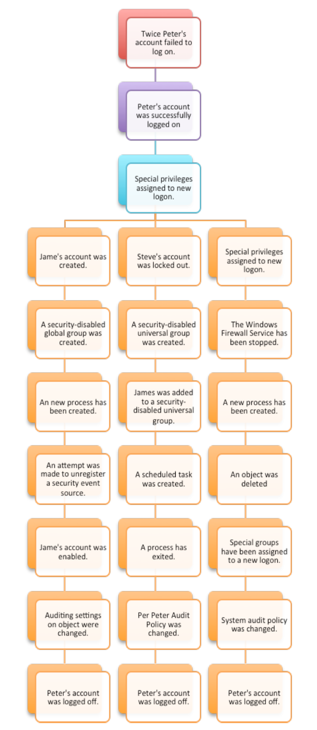
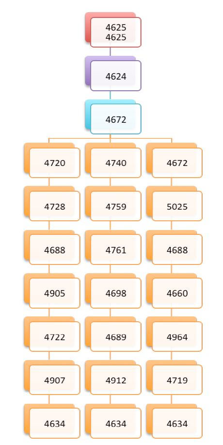
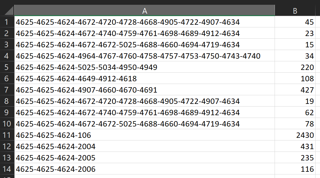
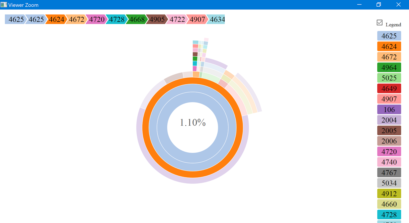
Eric Kapfhammer, our lead data scientist on our Microsoft Windows and Devices Group Blue Team. The ideal Windows Event ID for such activity is clearly 4624: an account was successfully logged on. This event is typically one of the top 5 events in terms of volume in most environments, and has multiple type codes including Network, Service, and RemoteInteractive.
User accounts will begin to show patterns over time, in aggregate, including:
  • Seasonality: day of week, patch cycles, 
  • Trend: volume of logons increasing/decreasing over time
  • Noise: randomness
You could look at 4624 with a Z-score model, which sets a threshold based on the number of standard deviations away from an average count over a given period of time, but this is a fairly simple model. The higher the value, the greater the degree of “anomalousness”.
Preferably, via Time Series Regression (TSR), your feature set is more rich:
  • Statistical method for predicting a future response based on the response history (known as autoregressive dynamics) and the transfer of dynamics from relevant predictors
  • Understand and predict the behavior of dynamic systems from experimental or observational data
  • Commonly used for modeling and forecasting of economic, financial and biological systems
How to spot the anomaly in a sea of logon data?
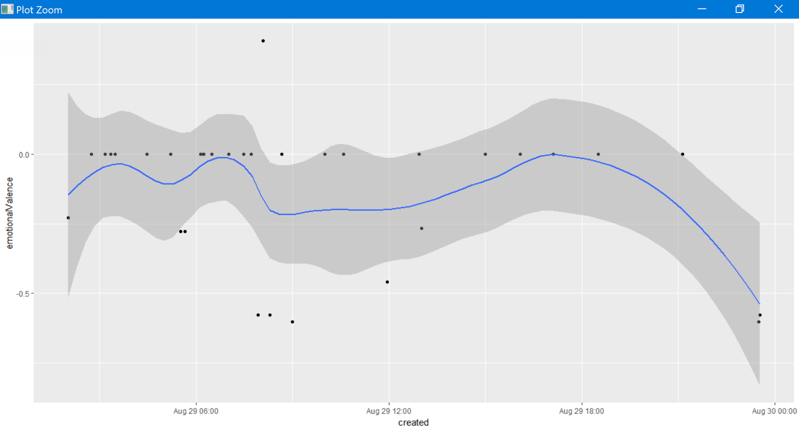
Let’s imagine our user, DARPA-549521, in the SUPERSECURE domain, with 90 days of aggregate 4624 Type 10 events by day.

Figure 9: User logon data

With 210 line of R, including comments, log read, file output, and graphing we can visualize and alert on DARPA-549521’s data as seen in Figure 10

Figure 10: User behavior outside the confidence interval

We can detect when a user’s account exhibits  changes in their seasonality as it relates to a confidence interval established (learned) over time. In this case, on 27 AUG 2017, the user topped her threshold of 19 logons thus triggering an exception. Now imagine using this model to spot anomalous user behavior across all users and you get a good feel for the model’s power.
Eric points out that there are, of course, additional options for modeling including:

  • Seasonal and Trend Decomposition using Loess (STL)
    • Handles any type of seasonality ~ can change over time
    • Smoothness of the trend-cycle can also be controlled by the user
    • Robust to outliers
  • Classification and Regression Trees (CART)
    • Supervised learning approach: teach trees to classify anomaly / non-anomaly
    • Unsupervised learning approach: focus on top-day hold-out and error check
  • Neural Networks
    • LSTM / Multiple time series in combination
These are powerful next steps in your capabilities, I want you to be brave, be creative, go forth and add elements of data science and visualization to your practice. R and Python are well supported and broadly used for this mission and can definitely help you detect attackers faster, contain incidents more rapidly, and enhance your in-house detection and remediation mechanisms.
All the code as I can share is here; sorry, I can only share the TSR example without the source.
All the best in your endeavors!
Cheers…until next time.

Continue reading toolsmith #129 – DFIR Redefined: Deeper Functionality for Investigators with R – Part 2

toolsmith #128 – DFIR Redefined: Deeper Functionality for Investigators with R – Part 1

“To competently perform rectifying security service, two critical incident response elements are necessary: information and organization.” ~ Robert E. Davis

I’ve been presenting DFIR Redefined: Deeper Functionality for Investigators with R across the country at various conference venues and thought it would helpful to provide details for readers.
The basic premise?
Incident responders and investigators need all the help they can get.
Let me lay just a few statistics on you, from Secure360.org’s The Challenges of Incident Response, Nov 2016. Per their respondents in a survey of security professionals:

  • 38% reported an increase in the number of hours devoted to incident response
  • 42% reported an increase in the volume of incident response data collected
  • 39% indicated an increase in the volume of security alerts

In short, according to Nathan Burke, “It’s just not mathematically possible for companies to hire a large enough staff to investigate tens of thousands of alerts per month, nor would it make sense.”
The 2017 SANS Incident Response Survey, compiled by Matt Bromiley in June, reminds us that “2016 brought unprecedented events that impacted the cyber security industry, including a myriad of events that raised issues with multiple nation-state attackers, a tumultuous election and numerous government investigations.” Further, “seemingly continuous leaks and data dumps brought new concerns about malware, privacy and government overreach to the surface.”
Finally, the survey shows that IR teams are:

  • Detecting the attackers faster than before, with a drastic improvement in dwell time
  • Containing incidents more rapidly
  • Relying more on in-house detection and remediation mechanisms

To that end, what concepts and methods further enable handlers and investigators as they continue to strive for faster detection and containment? Data science and visualization sure can’t hurt. How can we be more creative to achieve “deeper functionality”? I propose a two-part series on Deeper Functionality for Investigators with R with the following DFIR Redefined scenarios:

  • Have you been pwned?
  • Visualization for malicious Windows Event Id sequences
  • How do your potential attackers feel, or can you identify an attacker via sentiment analysis?
  • Fast Frugal Trees (decision trees) for prioritizing criticality

R is “100% focused and built for statistical data analysis and visualization” and “makes it remarkably simple to run extensive statistical analysis on your data and then generate informative and appealing visualizations with just a few lines of code.”

With R you can interface with data via file ingestion, database connection, APIs and benefit from a wide range of packages and strong community investment.
From the Win-Vector Blog, per John Mount “not all R users consider themselves to be expert programmers (many are happy calling themselves analysts). R is often used in collaborative projects where there are varying levels of programming expertise.”
I propose that this represents the vast majority of us, we’re not expert programmers, data scientists, or statisticians. More likely, we’re security analysts re-using code for our own purposes, be it red team or blue team. With a very few lines of R investigators might be more quickly able to reach conclusions.
All the code described in the post can be found on my GitHub.

Have you been pwned?

This scenario I covered in an earlier post, I’ll refer you to Toolsmith Release Advisory: Steph Locke’s HIBPwned R package.

Visualization for malicious Windows Event Id sequences

Windows Events by Event ID present excellent sequenced visualization opportunities. A hypothetical scenario for this visualization might include multiple failed logon attempts (4625) followed by a successful logon (4624), then various malicious sequences. A fantastic reference paper built on these principle is Intrusion Detection Using Indicators of Compromise Based on Best Practices and Windows Event Logs. An additional opportunity for such sequence visualization includes Windows processes by parent/children. One R library particularly well suited to is TraMineR: Trajectory Miner for R. This package is for mining, describing and visualizing sequences of states or events, and more generally discrete sequence data. It’s primary aim is the analysis of biographical longitudinal data in the social sciences, such as data describing careers or family trajectories, and a BUNCH of other categorical sequence data. Somehow though, the project page somehow fails to mention malicious Windows Event ID sequences. 🙂 Consider Figures 1 and 2 as retrieved from above mentioned paper. Figure 1 are text sequence descriptions, followed by their related Windows Event IDs in Figure 2.
Figure 1
Figure 2

Taking related log data, parsing and counting it for visualization with R would look something like Figure 3.

Figure 3
How much R code does it take to visualize this data with a beautiful, interactive sunburst visualization? Three lines, not counting white space and comments, as seen in the video below.
A screen capture of the resulting sunburst also follows as Figure 4.

Figure 4

How do your potential attackers feel, or can you identify an attacker via sentiment analysis?
Do certain adversaries or adversarial communities use social media? Yes
As such, can social media serve as an early warning system, if not an actual sensor? Yes
Are certain adversaries, at times, so unaware of OpSec on social media that you can actually locate them or correlate against other geo data? Yes
Some excellent R code to assess Twitter data with includes Jeff Gentry’s twitteR and rtweet to interface with the Twitter API.
  • twitteR: provides access to the Twitter API. Most functionality of the API is supported, with a bias towards API calls that are more useful in data analysis as opposed to daily interaction.
  • Rtweet: R client for interacting with Twitter’s REST and stream API’s.
The code and concepts here are drawn directly from Michael Levy, PhD UC Davis: Playing With Twitter.
Here’s the scenario: DDoS attacks from hacktivist or chaos groups.
Attacker groups often use associated hashtags and handles and the minions that want to be “part of” often retweet and use the hashtag(s). Individual attackers either freely give themselves away, or often become easily identifiable or associated, via Twitter. As such, here’s a walk-through of analysis techniques that may help identify or better understand the motives of certain adversaries and adversary groups. I don’t use actual adversary handles here, for obvious reasons. I instead used a DDoS news cycle and journalist/bloggers handles as exemplars. For this example I followed the trail of the WireX botnet, comprised mainly of Android mobile devices utilized to launch a high-impact DDoS extortion campaign against multiple organizations in the travel and hospitality sector in August 2017. I started with three related hashtags: 
  1. #DDOS 
  2. #Android 
  3. #WireX
We start with all related Tweets by day and time of day. The code is succinct and efficient, as noted in Figure 5.

Figure 5

The result is a pair of graphs color coded by tweets and retweets per Figure 6.

Figure 6

This gives you an immediate feels for spikes in interest by day as well as time of day, particularly with attention to retweets.

Want to see what platforms potential adversaries might be tweeting from? No problem, code in Figure 7.

Figure 7

The result in the scenario ironically indicates that the majority of related tweets using our hashtags of interest are coming from Androids per Figure 8. 🙂

Figure 8
Now to the analysis of emotional valence, or the “the intrinsic attractiveness (positive valence) or averseness (negative valence) of an event, object, or situation.”
orig$text[which.max(orig$emotionalValence)] tells us that the most positive tweet is “A bunch of Internet tech companies had to work together to clean up #WireX #Android #DDoS #botnet.”
orig$text[which.min(orig$emotionalValence)] tells us that “Dangerous #WireX #Android #DDoS #Botnet Killed by #SecurityGiants” is the most negative tweet.
Interesting right? Almost exactly the same message, but very different valence.
How do we measure emotional valence changes over the day? Four lines later…
filter(orig, mday(created) == 29) %>%
  ggplot(aes(created, emotionalValence)) +
  geom_point() + 
  geom_smooth(span = .5)
…and we have Figure 9, which tell us that most tweets about WireX were emotionally neutral on 29 AUG 2017, around 0800 we saw one positive tweet, a more negative tweets overall in the morning.

Figure 9

Another line of questioning to consider: which tweets are more often retweeted, positive or negative? As you can imagine with information security focused topics, negativity wins the day.
Three lines of R…
ggplot(orig, aes(x = emotionalValence, y = retweetCount)) +
  geom_point(position = ‘jitter’) +
  geom_smooth()
…and we learn just how popular negative tweets are in Figure 10.

Figure 10

There are cluster of emotionally neutral retweets, two positive retweets, and a load of negative retweets. This type of analysis can quickly lead to a good feel for the overall sentiment of an attacker collective, particularly one with less opsec and more desire for attention via social media.
In Part 2 of DFIR Redefined: Deeper Functionality for Investigators with R we’ll explore this scenario further via sentiment analysis and Twitter data, as well as Fast Frugal Trees (decision trees) for prioritizing criticality.
Let me know if you have any questions on the first part of this series via @holisticinfosec or russ at holisticinfosec dot org.
Cheers…until next time. 

The post toolsmith #128 – DFIR Redefined: Deeper Functionality for Investigators with R – Part 1 appeared first on Security Boulevard.

Continue reading toolsmith #128 – DFIR Redefined: Deeper Functionality for Investigators with R – Part 1

toolsmith #128 – DFIR Redefined: Deeper Functionality for Investigators with R – Part 1

“To competently perform rectifying security service, two critical incident response elements are necessary: information and organization.” ~ Robert E. DavisI’ve been presenting DFIR Redefined: Deeper Functionality for Investigators with R across t… Continue reading toolsmith #128 – DFIR Redefined: Deeper Functionality for Investigators with R – Part 1